
CSS @keyframes完全ガイド:animation-delay・iteration-count・alternateの動作仕様と注意点
CSSアニメーションの基本は理解していても、@keyframesの仕様や、
animation-delay・animation-iteration-count・animation-direction
などのプロパティを組み合わせたときの挙動まで正確に把握している方は意外と少ないかもしれません。
このページでは、「なぜそう動くのか?」をコードとともに丁寧に解説し、CSSだけで意図通りの動きを実現するための知識を深めます。
CSSのanimationプロパティは@keyframesと共に使用します。
CSSセレクタ {
  animation:
    [アニメーション名] [再生時間] [変化の形式] [開始までの遅延時間]
    [繰返し回数] [再生方向] [開始前終了後の適用] [再生か停止か];
}
@keyfames [アニメーション名]{
    0%{ 適用するCSS }
    ・・・
  100%{ 適用するCSS }
}
| [アニメーション名] animation-name |
対象となる@keyframesの[アニメーション名] | ||||||||
| [再生時間] animation-duration |
1回のアニメーションの再生時間 1秒なら 1s 、500ミリ秒なら 500ms |
||||||||
| [変化の形式] animation-timing-function |
linear(直線補完)、ease(緩やかに始まり急加速し緩やかに終わる)、ease-in(緩やかに始まる)、ease-out(緩やかに終わる)、easein-out(緩やかに始まり緩やかに終わる) | ||||||||
| [開始までの遅延時間] animation-delay |
アニメーション開始までの遅延時間 1秒なら 1s 、500ミリ秒なら 500ms |
||||||||
| [繰返し回数] animation-iteration-count |
アニメーションの繰り返し回数。 1回なら 1、2.5回なら 2.5、無限なら infinite を指定します。 |
||||||||
| [再生方向] animation-direction |
アニメーションの再生方向。
|
||||||||
| [開始前終了後の適用] animation-fill-mode |
アニメーションの開始前、終了後に@keyfamesで指定したCSSを適用するかどうか。
|
||||||||
| [再生か停止か] animation-play-state |
アニメーションが一時停止か再生かを指定。
|
例1.文字色をアニメーション
以下は文字の色を赤から青にアニメーションしています。
文字の色が変わる
<div class="ani1">文字の色が変わる</div>
<style>
  div.ani1{
    animation: ani1 1s linear 0s infinite alternate;
  }
  @keyframes ani1{
      0%{color:red;}
    100%{color:blue;}
  }
</style>
例2.複数のアニメーション
,(カンマ)で区切って複数のアニメーションを指定することが出来ます
背景と文字の色が変わる
<div class="ani2">背景と文字の色が変わる</div>
<style>
  div.ani2{
    animation: ani21 1s linear 0s infinite alternate,
               ani22 2s linear 0s infinite alternate;
  }
  @keyframes ani21{
      0%{color:red;}
    100%{color:blue;}
  }
  @keyframes ani22{
      0%{background:white;}
    100%{background:green;}
  }
</style>
例3.色々なアニメーション
ぼかしフィルターと回転のアニメーション
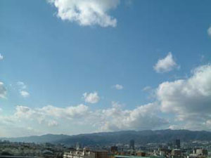
<div class="ani3">
  <img src="./imgs/0001s.jpg" style="width:100%;height:auto;" width="300" height="255" alt="空">
</div>
<style>
  div.ani3{
    width:250px;
    transform-origin(center);
    animation: ani3 2s linear 0s infinite alternate;
  }
  @keyframes ani3{
      0%{filter:blur(0px); transform:rotateZ(0deg );}
    100%{filter:blur(4px); transform:rotateZ(30deg);}
  }
</style>
回転と縮小のアニメーション
<div class="ani4">
  <img src="./imgs/0001s.jpg" style="width:100%;height:auto;" width="300" height="255" alt="空">
</div>
<style>
  div.ani4{
    width:250px;
    transform-origin(center);
    animation: ani4 2s linear 0s infinite alternate;
  }
  @keyframes ani4{
      0%{transform:scale(1.0, 1.0) rotateY(0deg  );}
    100%{transform:scale(0.5, 0.5) rotateY(90deg);}
  }
</style>
cplip-pathのアニメーション
cplip-pathで楕円
アニメーションを行う
アニメーションを行う
<div class="ani5"<
  cplip-pathで楕円<br<
  アニメーションを行う
</div<
<style<
  div.ani5{
    padding:40px;
    margin:20px;
    width:200px;
    height:40px;
    background:#4f8;
    animation: ani5 2s linear 0s infinite alternate;
  }
  @keyframes ani5{
      0%{clip-path:ellipse(50% 50% at 50% 50%);}
     30%{clip-path:ellipse(50% 50% at 50% 50%);}
    100%{clip-path:ellipse(30% 30% at 50% 50%);}
  }
</style<