
コピペで簡単に使える幅640以下で2列表示に切り替わるレスポンシブテーブル(デザイン2)
このテーブルは、CSS & JavaScriptで簡単に実装できるレスポンシブ対応のテーブル(表)です。
PCでは通常の表、スマホでは幅640px以下になると2列表示に自動変換!
コピペだけで導入できるので業務ツールやデータ表示ページにも最適です。
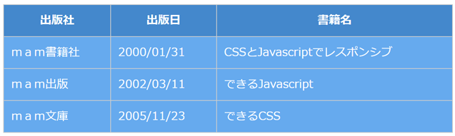
ウィンドウ幅
640px以上
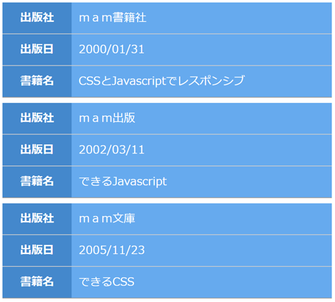
ウィンドウ幅
640px以下
実行例
PCの場合はウィンドウの大きさを変えるか、スマホの場合は横向けにするか縦向けにすると、 ウィンドウ幅640px以上と以下でテーブルの表示が切り替わります。
| 出版社 | 出版日 | 書籍名 |
|---|---|---|
| mam書籍社 | 2000/01/31 | CSSとJavascriptでレスポンシブ |
| mam出版 | 2002/03/11 | できるJavascript |
| mam文庫 | 2005/11/23 | できるCSS |
| 色 | 速度 | サイズ | 形状 | GIFファイル |
|---|---|---|---|---|
| ピンク | 遅い | 32x32 | 2D-1 |  |
| 黒 | 遅い | 64x64 | 2D-2 |  |
| 青 | 普通 | 32x32 | 2D-3 |  |
| 青 | 遅い | 64x64 | 3D-5 |  |
| 緑 | 遅い | 64x64 | 3D-6 |  |
HTML,CSS,Javascriptソースコード
<!DOCTYPE html>
<html>
<head>
<style>
  table.blueback th{
    background: #48C;
    color: #fff;
    font-weight:bold;
  }
  table.blueback td{
    background: #6AE;
    color: #fff;
  }
  table.redback th{
    background: #D62;
    color: #fff;
  }
  table.redback td{
    background: #E84;
    color: #fff;
  }
  table.mamTableResponsive {
    width:100%;
    border-collapse:collapse;
    border:none;
    border-spacing:0;
    table-layout:auto;
  }
  table.mamTableResponsive th {
    box-sizing:border-box;
    border: solid 1px #ccc;
    margin:0;
    padding:10px;
  }
  table.mamTableResponsive td {
    box-sizing:border-box;
    border: solid 1px #ccc;
    margin:0;
    padding:10px;
  }
  table.mamTableResponsive .mamBottomBorderThick{
    border-top:none;
    border-left:none;
    border-right:none;
    border-bottom:solid 1px #999;
  }
  table.mamTableResponsive .mamBottomBorderThin{
    border-left:none;
    border-right:none;
    border-top:none;
    border-bottom:solid 1px #ccc;
  }
  table.mamTableResponsive .mamBottomBorderBlank{
    border:none;
    height:8px;
    padding:0;
    background-color: transparent;
  }
</style>
<script>
  const threshW=640;
  var mamTblRes=[];
  window.addEventListener('DOMContentLoaded',function(){
    let i,j,k;
    var tbl=document.querySelectorAll('table.mamTableResponsive');
    for(i=0;i<tbl.length;i++){
      let th=tbl[i].querySelectorAll('thead');
      let tb=tbl[i].querySelectorAll('tbody');
      if(th.length==1 && tb.length==1){
        let arr={};
        arr["table"]=tbl[i];
        arr["thead"]=th[0];
        arr["tbody"]=tb[0];
        mamTblRes.push(arr);
      }
    }
    for(i=0;i<mamTblRes.length;i++){
      let tb=document.createElement('tbody');
      for(k=0;k<mamTblRes[i].tbody.children.length;k++){
        for(j=0;j<mamTblRes[i].thead.children[0].children.length;j++){
          let tr=document.createElement('tr');
          tr.appendChild(mamTblRes[i].thead.children[0].children[j].cloneNode(true));
          tr.appendChild(mamTblRes[i].tbody.children[k].children[j].cloneNode(true));
          if(j==(mamTblRes[i].thead.children[0].children.length-1)){
            tr.children[0].classList.add("mamBottomBorderThick");
            tr.children[1].classList.add("mamBottomBorderThick");
            tb.appendChild(tr);
            if(k!=(mamTblRes[i].tbody.children.length-1)){
              tr=document.createElement('tr');
              tr.classList.add('mamBottomBorderBlank');
              let td=document.createElement('td');
              td.classList.add('mamBottomBorderBlank');
              td.setAttribute('colspan',2);
              tr.appendChild(td);
              tb.appendChild(tr);
            }
          }else{
            tr.children[0].classList.add("mamBottomBorderThin");
            tr.children[1].classList.add("mamBottomBorderThin");
            tb.appendChild(tr);
          }
        }
      }
      mamTblRes[i]["tbodyR"]=tb;
    }
    mamTableResponsive();
  },false);
  function mamTableResponsive(){
    let i;
    if(mamTblRes.length>0 && window.innerWidth<threshW){
      for(i=0;i<mamTblRes.length;i++){
        if(mamTblRes[i].table.getElementsByTagName("thead").length>0){
          mamTblRes[i].table.appendChild(mamTblRes[i].tbodyR);
          mamTblRes[i].table.removeChild(mamTblRes[i].thead);
          mamTblRes[i].table.removeChild(mamTblRes[i].tbody);
        }
      }
    }else{
      for(i=0;i<mamTblRes.length;i++){
        if(mamTblRes[i].table.getElementsByTagName("thead").length==0){
          mamTblRes[i].table.removeChild(mamTblRes[i].tbodyR);
          mamTblRes[i].table.appendChild(mamTblRes[i].thead);
          mamTblRes[i].table.appendChild(mamTblRes[i].tbody);
        }
      }
    }
  }
  window.addEventListener('resize',function(){
    mamTableResponsive();
  },false);
</script>
</head>
<body>
  <table class="mamTableResponsive blueback">
    <thead>
      <tr>
        <th>出版社</th>
        <th>出版日</th>
        <th>書籍名</th>
      </tr>
    </thead>
    <tbody>
      <tr>
        <td>mam書籍社</td>
        <td>2000/01/31</td>
        <td>CSSとJavascriptでレスポンシブ</td>
      </tr>
      <tr>
        <td>mam出版</td>
        <td>2002/03/11</td>
        <td>できるJavascript</td>
      </tr>
      <tr>
        <td>mam文庫</td>
        <td>2005/11/23</td>
        <td>できるCSS</td>
      </tr>
    </tbody>
  </table>
</body>
</html>