
A Copy‑and‑Paste Responsive Table That Switches to a Two‑Column Layout Below 640px (Design 1)
This table is a responsive layout built with simple CSS and JavaScript.
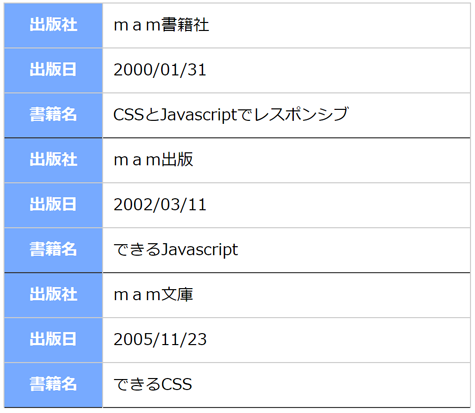
On desktop it appears as a standard table, and on smartphones it automatically switches to a two‑column layout when the screen width is 640px or less.
Since it can be added with simple copy‑and‑paste, it’s ideal for business tools and data display pages.
Window width
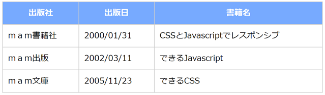
640px or more
Window width
640px or less
Demo
On a PC, resizing the window—and on a smartphone, rotating the device between portrait and landscape—will switch the table’s layout depending on whether the window width is above or below 640px.
| Publisher | Publication Date | Book Title |
|---|---|---|
| mam Publishing Co. | 2000/01/31 | Responsive Design with CSS and JavaScript |
| mam Press | 2002/03/11 | Mastering JavaScript |
| mam Library | 2005/11/23 | Mastering CSS |
| Color | Speed | Size | Type | GIF File |
|---|---|---|---|---|
| Pink | Slow | 32x32 | 2D-1 |  |
| Black | Slow | 64x64 | 2D-2 |  |
| Blue | Normal | 32x32 | 2D-3 |  |
| Blue | Slow | 64x64 | 3D-5 |  |
| Green | Slow | 64x64 | 3D-6 |  |
HTML,CSS,Javascript Source Code
<!DOCTYPE html>
<html>
<head>
<style>
  table.mamTableResponsive {
    width:100%;
    border-collapse:collapse;
    border:none;
    border-spacing:0;
    table-layout:auto;
  }
  table.mamTableResponsive th {
    box-sizing:border-box;
    background: #7AF;
    border: solid 1px #ccc;
    color: #fff;
    margin:0;
    padding:10px;
  }
  table.mamTableResponsive td {
    box-sizing:border-box;
    border: solid 1px #ccc;
    color: #000;
    margin:0;
    padding:10px;
  }
  table.mamTableResponsive .mamBottomBorderThick{
    border-bottom:solid 1px #333;
  }
  table.mamTableResponsive .mamBottomBorderThin{
    border-bottom:solid 1px #ccc;
  }
</style>
<script>
  const threshW=640;
  var mamTblRes=[];
  window.addEventListener('DOMContentLoaded',function(){
    let i,j,k;
    var tbl=document.querySelectorAll('table.mamTableResponsive');
    for(i=0;i<tbl.length;i++){
      let th=tbl[i].querySelectorAll('thead');
      let tb=tbl[i].querySelectorAll('tbody');
      if(th.length==1 && tb.length==1){
        let arr={};
        arr["table"]=tbl[i];
        arr["thead"]=th[0];
        arr["tbody"]=tb[0];
        mamTblRes.push(arr);
      }
    }
    for(i=0;i<mamTblRes.length;i++){
      let tb=document.createElement('tbody');
      for(k=0;k<mamTblRes[i].tbody.children.length;k++){
        for(j=0;j<mamTblRes[i].thead.children[0].children.length;j++){
          let tr=document.createElement('tr');
          tr.appendChild(mamTblRes[i].thead.children[0].children[j].cloneNode(true));
          tr.appendChild(mamTblRes[i].tbody.children[k].children[j].cloneNode(true));
          if(j==(mamTblRes[i].thead.children[0].children.length-1)){
            tr.children[0].classList.add("mamBottomBorderThick");
            tr.children[1].classList.add("mamBottomBorderThick");
          }else{
            tr.children[0].classList.add("mamBottomBorderThin");
            tr.children[1].classList.add("mamBottomBorderThin");
          }
          tb.appendChild(tr);
        }
      }
      mamTblRes[i]["tbodyR"]=tb;
    }
    mamTableResponsive();
  },false);
  function mamTableResponsive(){
    let i;
    if(mamTblRes.length>0 && window.innerWidth<threshW){
      for(i=0;i<mamTblRes.length;i++){
        if(mamTblRes[i].table.getElementsByTagName("thead").length>0){
          mamTblRes[i].table.appendChild(mamTblRes[i].tbodyR);
          mamTblRes[i].table.removeChild(mamTblRes[i].thead);
          mamTblRes[i].table.removeChild(mamTblRes[i].tbody);
        }
      }
    }else{
      for(i=0;i<mamTblRes.length;i++){
        if(mamTblRes[i].table.getElementsByTagName("thead").length==0){
          mamTblRes[i].table.removeChild(mamTblRes[i].tbodyR);
          mamTblRes[i].table.appendChild(mamTblRes[i].thead);
          mamTblRes[i].table.appendChild(mamTblRes[i].tbody);
        }
      }
    }
  }
  window.addEventListener('resize',function(){
    mamTableResponsive();
  },false);
</script>
</head>
<body>
  <table class="mamTableResponsive">
    <thead>
      <tr>
        <th>Publisher</th>
        <th>Publication Date</th>
        <th>Book Title</th>
      </tr>
    </thead>
    <tbody>
      <tr>
        <td>mam Publishing Co.</td>
        <td>2000/01/31</td>
        <td>Responsive Design with CSS and JavaScript</td>
      </tr>
      <tr>
        <td>mam Press</td>
        <td>2002/03/11</td>
        <td>Mastering JavaScript</td>
      </tr>
      <tr>
        <td>mam Library</td>
        <td>2005/11/23</td>
        <td>Mastering CSS</td>
      </tr>
    </tbody>
  </table>
</body>
</html>